A technology startup developing an AI powered research product needed help progressing the design of their Alpha system. They hired me to help design a user-friendly interface that would allow interaction with the vast resource of real-time data and unlock the power of the system.
Stakeholder workshop - problem definition
- Users needed quick access to a massive data source
- Split the search flow into Organisations and People
- Provide meaningful views of the data - visualisations and tabular
An intial look at the user flow suggested possible improvements
Prototypes
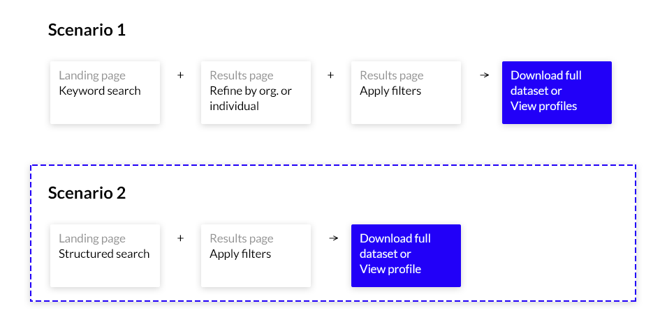
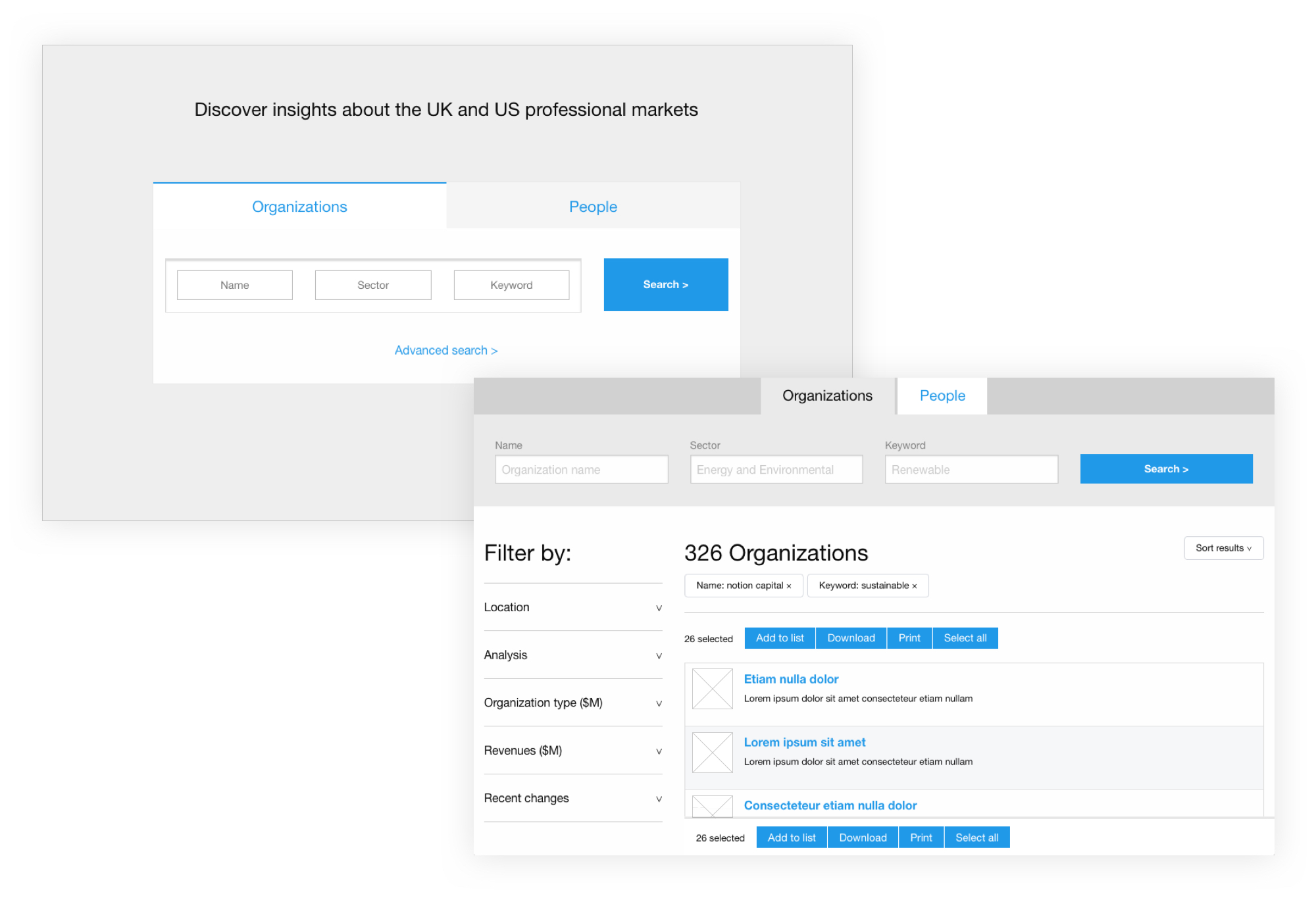
I quickly developed a set of search prototypes using a responsive HTML/CSS framework (Foundation) and a little PHP for the CEO to test with a number of students from Imperial College London. The objective being to identify the quickest, most intuitive and effective search solution.
My hypothesis was that the sooner we could return results to the user, the better.
Prototype search landing page and results page
Key learnings:
- 68% of users preferred the structured search over traditional keyword search
- 14% of users found the UI too complex, wanted more guidance
This was a positive outcome but the fact some users had issues led me to develop an alternative approach incorporating simple on-boarding techniques to offer reassurance and clarity to users unfamiliar with the system.
Visual affordance
Deciding on the positioning of key interface controls and their visual affordance can be crucial to the success of a user experience. Knowing this, I ran a series of quick tests using InVision software to settle an on-going debate within the team around the best navigation treatment, 'sidebar' or 'topbar'.
This element of the UI allowed users to quickly swap views of the same data.
Sidebar navigation vs Topbar
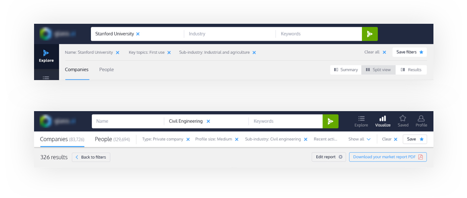
In the end, our test participants found the 'topbar' quicker to use, required less screen space and users found it less intrusive compared to the "sidebar" treatment for top-level search queries.
Also the proximity to the main search input helps when users are building out their query.
Another experiment
I also experimented with a split screen mode for advanced users featuring interactive charts and graphs on one side and a more tabular list of results on the other.
Split screen view
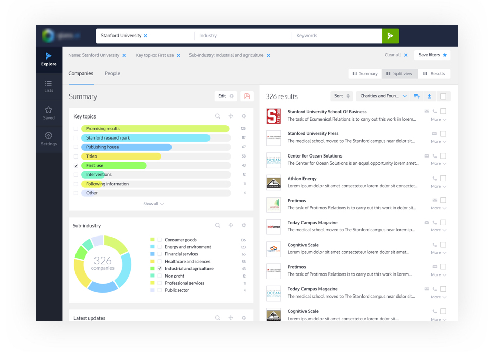
Following internal testing with the team, we agreed this approach introduced too much cognitive load for users, the data was far more accessible using the separate data or tabular views.
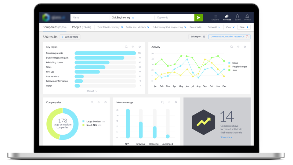
I designed a series of editable charts to help users visualise the data.
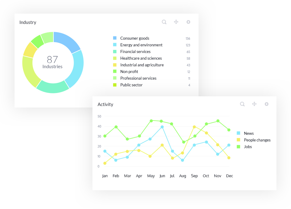
Experimenting with data panel designs
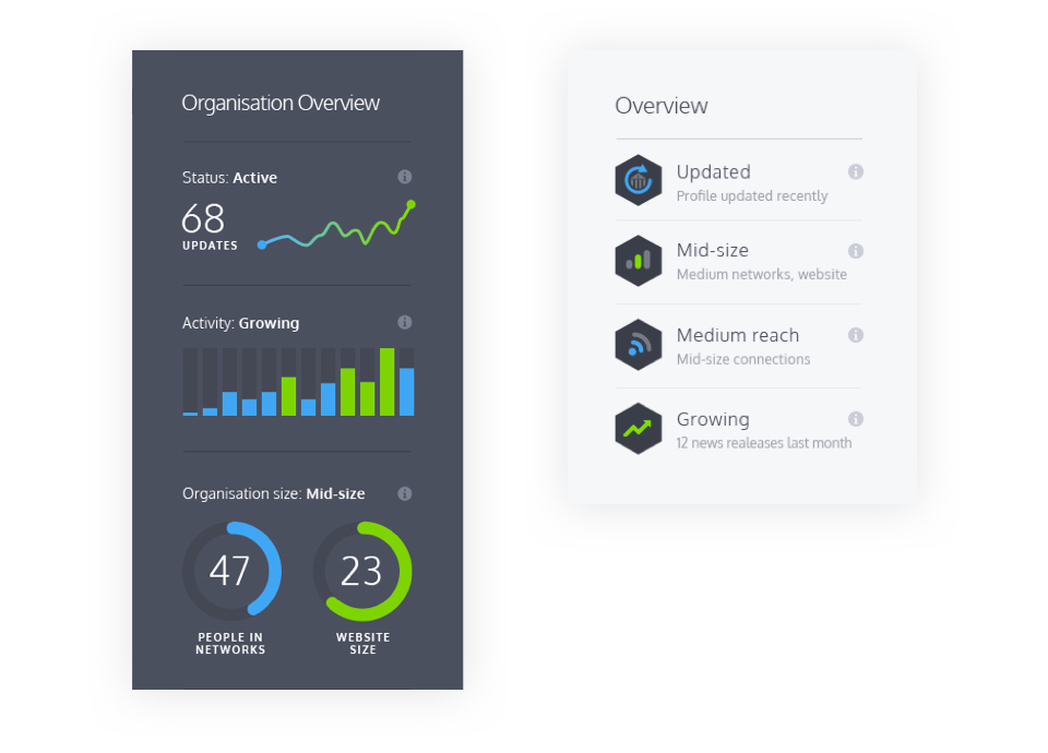
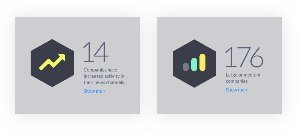
Statistic card designs
Success for an unrivalled system
Following the new user interface work, I also designed a logo, simple identity and promotional slides for the startup to use in presentations and conferences.
The groundbreaking new AI system went on to secure £1.5m funding later that year and has continued to grow in scope, recently launching an initial Beta product.
Learnings
The project forced me to keep an open mind to search patterns, the target users were specialists in their field of market research so this allowed a wider remit of exploration than some projects.
My involvement was during the Alpha stage so functionality, use cases and precise personas were still being locked down but I enjoyed the challenge of brainstorming with the team and exploring the possibilities of 'unlocking' the vast data source.